To mark its 40th anniversary, the Montreal Marathon decided to get a makeover and carve a whole new brand identity. By renewing its brand image, this legendary event, firmly imprinted in Montreal’s history clearly articulates its purpose: to be a unifying sporting event, where people, their health and their enjoyment are at the heart of the experience.

The goal
To restore the Montreal Marathon’s nobility and the notoriety that, until very recently, made it one of the world’s premier sporting events.
The mandate
To review the Montreal Marathon’s visual identity and integrate that of its partner, Beneva, so that together, they can coexist in a consistent and impactful brand ecosystem, one that can, above all, stand the test of time.
The inspiration
As a tribute to the rich sporting legacy of the City of Montreal, the Marathon’s identity overhaul mostly drew inspiration from the visual codes and graphics used for the first editions of the Montreal Marathon, but also those of the Montreal Olympics back in 1976.

The idea
The logo features an updated version of the pictogram with two runners joined in action, a symbol of the event’s universality. The idea of movement is expressed using a series of vibrant strips of colour, where the use of yellow lifts the brand’s identity by channeling a luminous, joyful and contemporary spirit.


Completing the colour yellow, purple was used inasmuch as it is Beneva’s key brand colour. As the major partner for this event, Beneva was encompassed in synergy and in a breath of modernity with the Montreal Marathon’s platform, which strives to be vibrant just like its host city.


Similar realisations
-
Read more

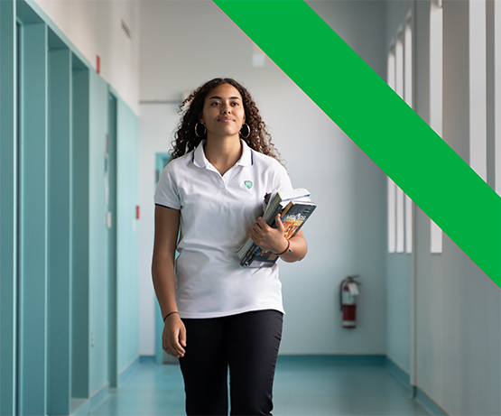
United we learn
The Collège Durocher Saint-Lambert teaches young citizens to be bold and confident. This private high school equips its students with the tools they need to become agents of change who will positively impact the world they live in.
Branding, Digital -
Read more


The potato gets
a makeoverThe « Épatante patate » (“Helluva potato”) was looking to renew its online platform in order to highlight Quebec’s potatoes, a staple comfort food that is deeply embedded in Quebec’s culture. The point was also to highlight the work of our very own potato packers and producers.
Digital